
Melena.
Brand identity and online store for a specialty coffee roaster that sells beans, grinders and espresso machines.
Scroll inside the frame to explore the live site
Sell the experience
Specialty coffee costs more than supermarket coffee, so the site has to show what you pay for from the very first screen: freshness, origin and the ritual of brewing. It also has to sell both beans and equipment in one easy store.
A website that feels like a coffee ritual
The hero tells the story of a cup in three scenes that play as you scroll. Below it sits a calm store with honest details about every lot.
- Name, logo, palette and packaging from scratch
- Scroll animation built from three video scenes
- Catalogue, product view, cart and subscription
- A mobile version designed on its own terms
Name and identity
“Melena” comes from the Ukrainian word for “ground”, as in freshly ground coffee: the grind, the hands, the morning ritual. The Latin wordmark works across the website and packaging, so the brand travels.
#EFE7DC#8A3B22#2A1A14#C9A46A#5F2A2F#F7F2EAA classic serif with character, a nod to old coffee-house signage.
A modern sans for descriptions, prices and buttons.
Recipe numbers, altitudes, SCA scores.
The bag range
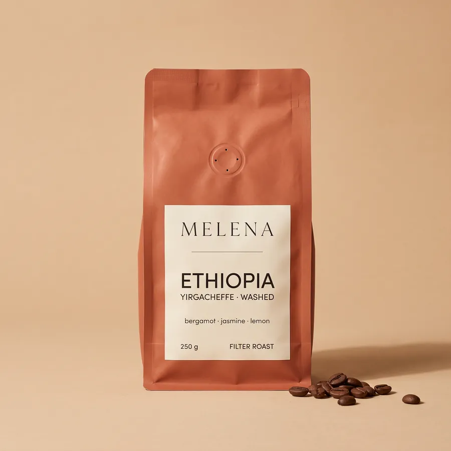
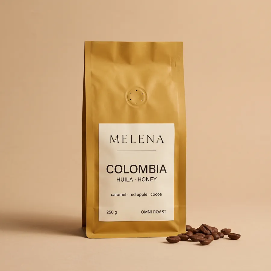
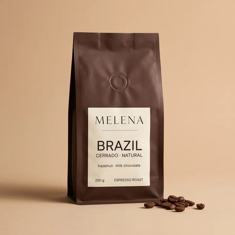
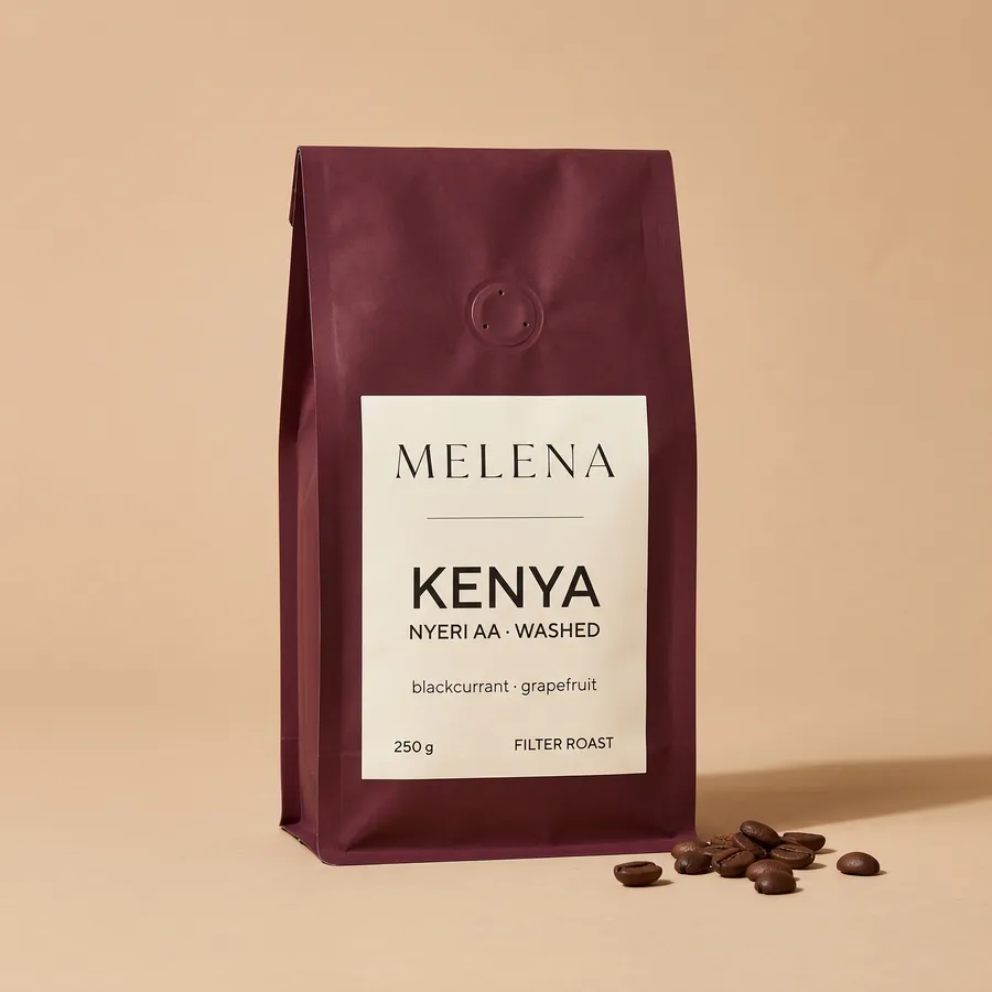
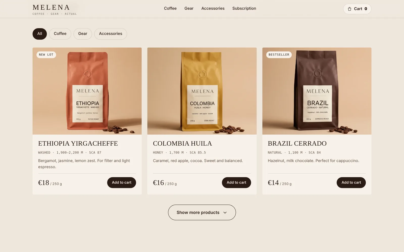
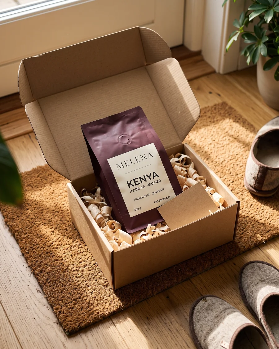
Each coffee gets its own bag colour while the label stays the same: brand, country, region, tasting notes and weight. Customers tell them apart instantly, on the shelf and in the catalogue.
The story of a cup
in three scenes
The video is split into frames that play with the scroll. Scroll down and the bean spins, the grinder comes apart, the coffee pours into the cup. Scroll back and it all rewinds. The background and header change colour with each scene.
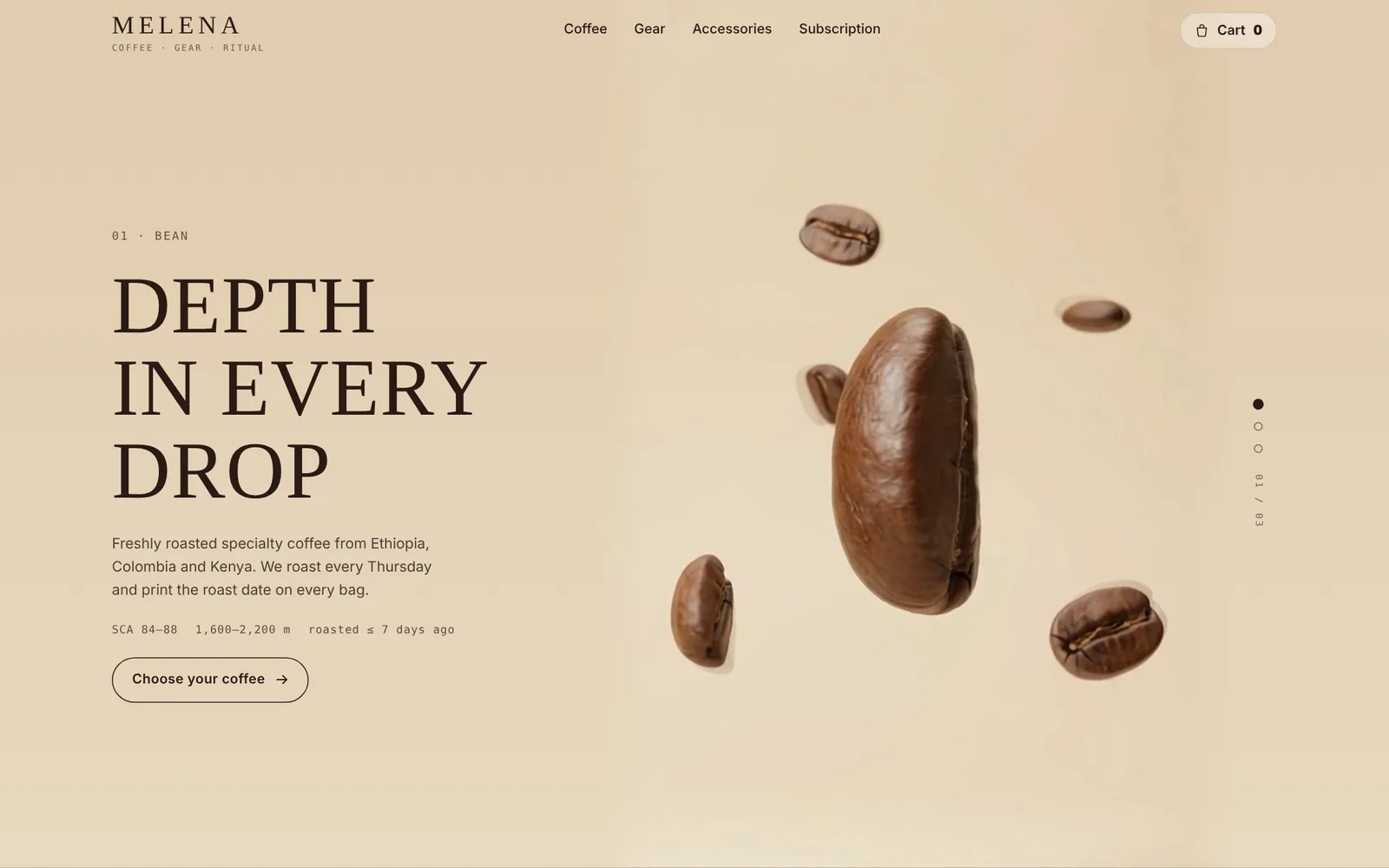
Bean
Keeps slowly turning even when you stop scrolling, floating in mid-air.
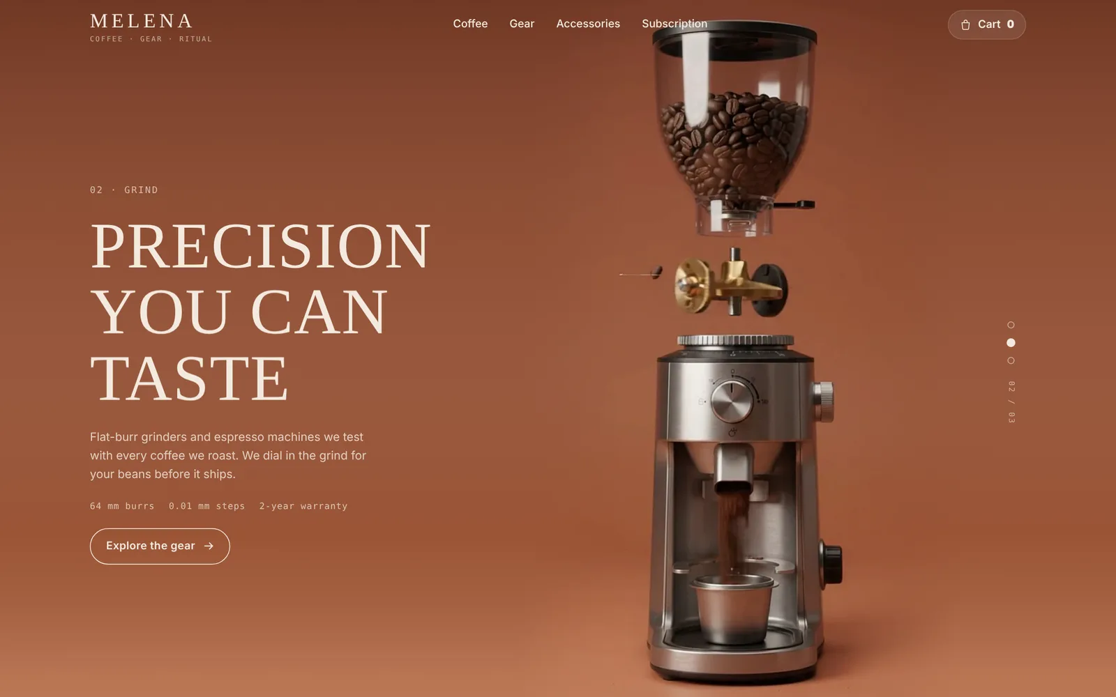
Grind
The grinder explodes into parts as fresh grounds fall into the cup.
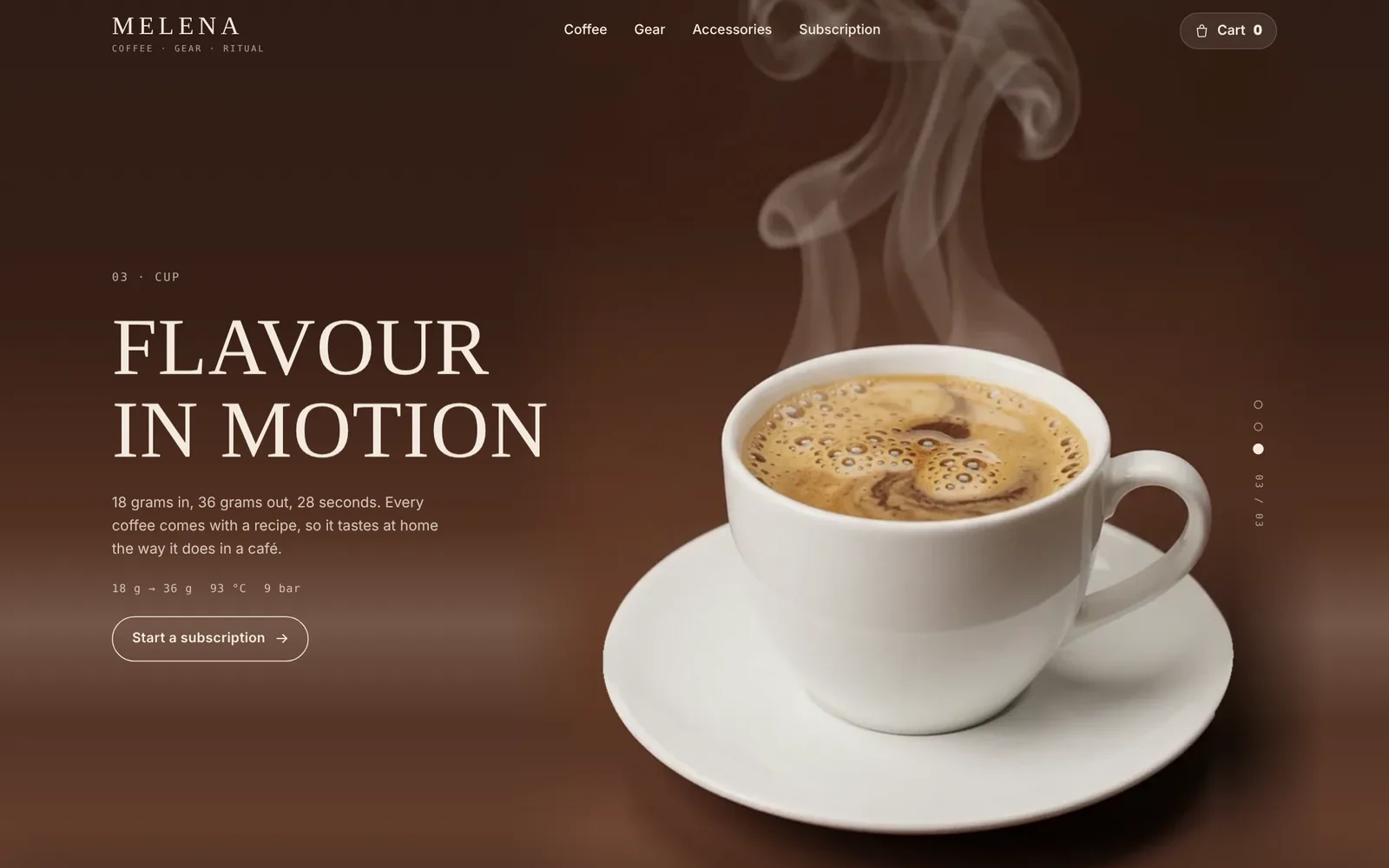
Cup
Coffee pours in a spiral and steam rises at the end.
Tablet and phone
The site adapts to every screen: on a tablet and a phone the layout rebuilds itself. Scroll inside the frames.
From browsing
to checkout
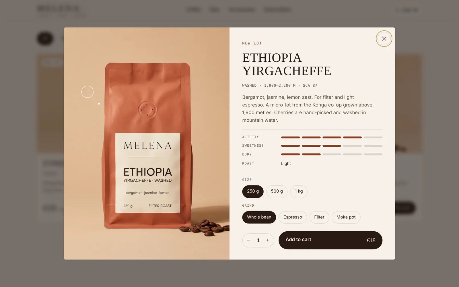
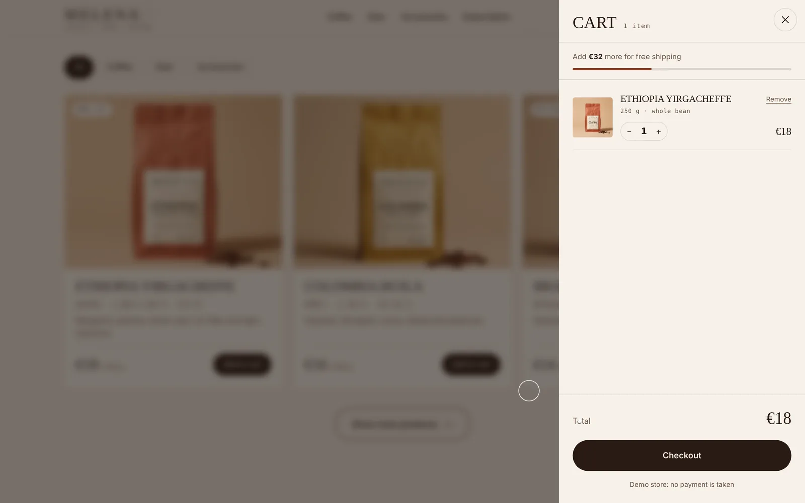
A filterable catalogue, a product view with a tasting profile and grind options, and a cart that nudges you towards free shipping. All without leaving the page.
Brand photography
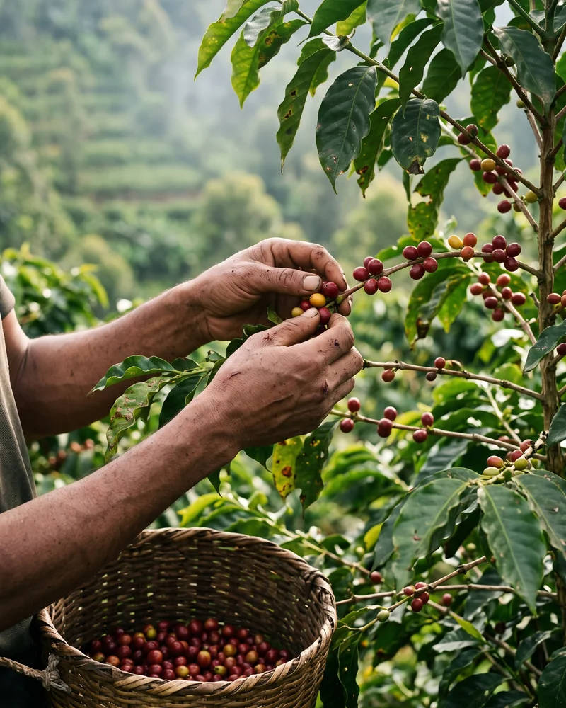
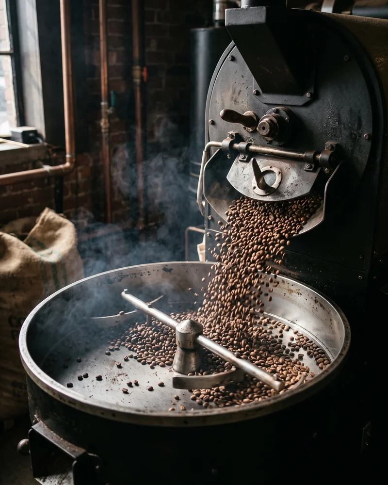
A photo series in one warm style: the farm, the roast, the packing and the delivery. Together they trace the bean’s journey from farm to front door.
Built from
scratch
No templates, no off-the-shelf themes. From the brand name to the last button in the cart, everything was conceived, designed and built in our studio.
- 01
Naming
“Melena”, from the Ukrainian for “ground”: the grind and the morning ritual.
- 02
Logo
Two versions: Cyrillic for the local site, Latin for packaging and export.
- 03
Palette & type
Cream, terracotta, chocolate and brass, with Forum serif for headings.
- 04
Packaging
A range of four bags: a colour for each coffee, one shared label.
- 05
Brand photos
A series from the farm to the box on the customer’s doorstep.
- 06
Web design
Every section, from the hero to the oversized footer wordmark.
- 07
Scroll animation
Three video scenes that play forwards and backwards with the scroll.
- 08
Store
Catalogue, product view with a tasting profile, cart and subscription.
- 09
Mobile
Designed separately for phones: compact, with swipeable sections.
- 10
Copywriting
Lot descriptions, tasting notes, recipes and every label on the site.
Want a site like this?
Tell us about your business and we’ll show you how to present it so customers want to buy.