
Cleany.
Brand identity and lead-generation website for a cleaning company serving apartments, offices and post-renovation spaces in Kyiv.
Scroll inside the frame to explore the live site
Earn trust in one screen
People let a cleaning company into their home, so they choose on trust. The site has to prove quality and reliability right away and turn a visit into a call or a request, on a phone as much as on a desktop.
A calm site that shows the result
A clean, warm identity, an interactive moment that lets visitors wipe the dust away themselves, and a short path from first look to order.
- Logo, palette and typography from scratch
- Interactive “wipe the dust” reveal
- Before and after gallery, reviews and FAQ
- SEO and analytics set up from day one
Name and identity
A simple drop with a vein of light inside: water, freshness, care. The wordmark is set in heavy Golos Text, friendly and easy to read on a van, a uniform or a phone screen.
#162117#55603F#8B9470#EFE6D6#E6D9C2#FAF8F3A confident, rounded sans that stays friendly at huge sizes.
Neutral and crisp for descriptions, prices and buttons.
Ratings, counters and service area.
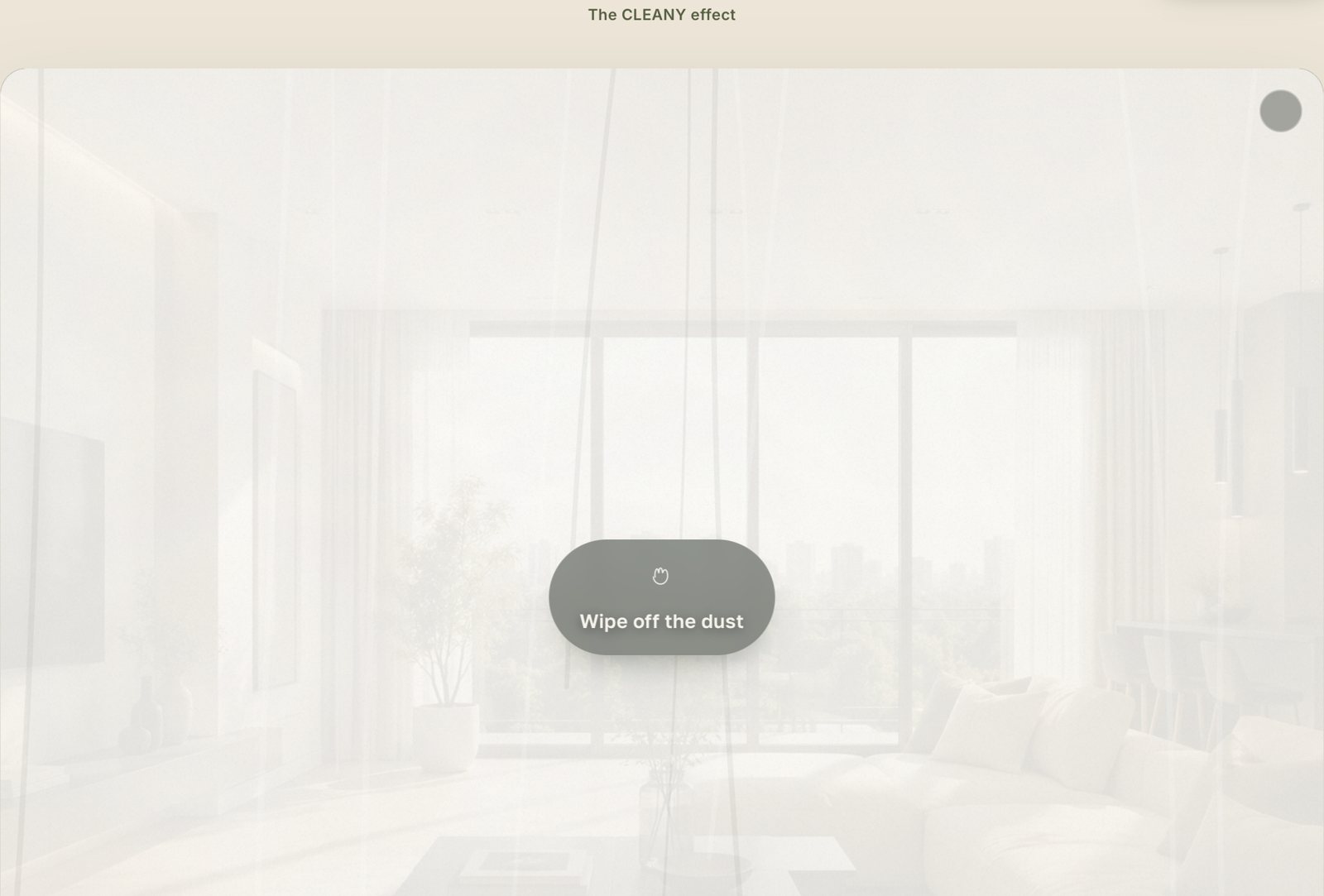
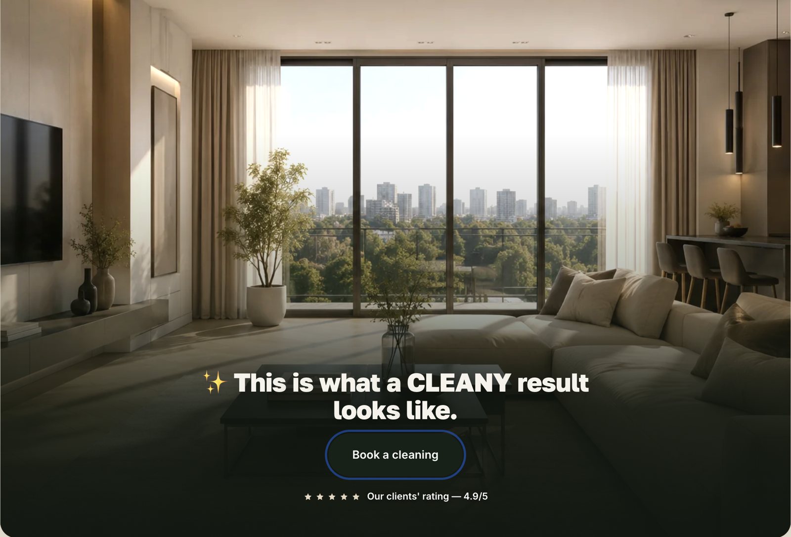
Wipe the dust,
see the result
Instead of telling visitors the result is clean, the site lets them do it. A fogged layer covers a finished room, and a swipe or a mouse move wipes it away. When most of it is clear, the room lights up and the order button appears.
Four services,
one clear system
Regular cleaning, offices, deep cleaning and post-renovation cleaning each get their own card and anchor, with a starting price and a clear next step.
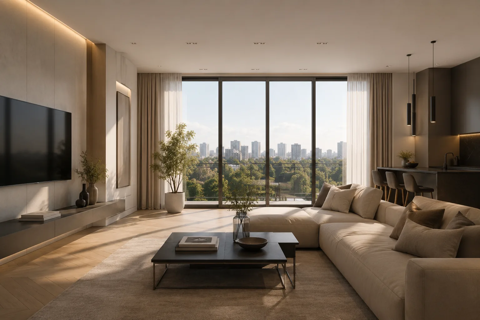
Apartments
Weekly, bi-weekly or one-off cleaning with a clear checklist.
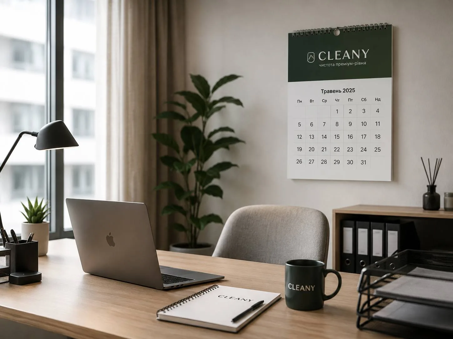
Offices
Scheduled cleaning that never stops the working day.
After renovation
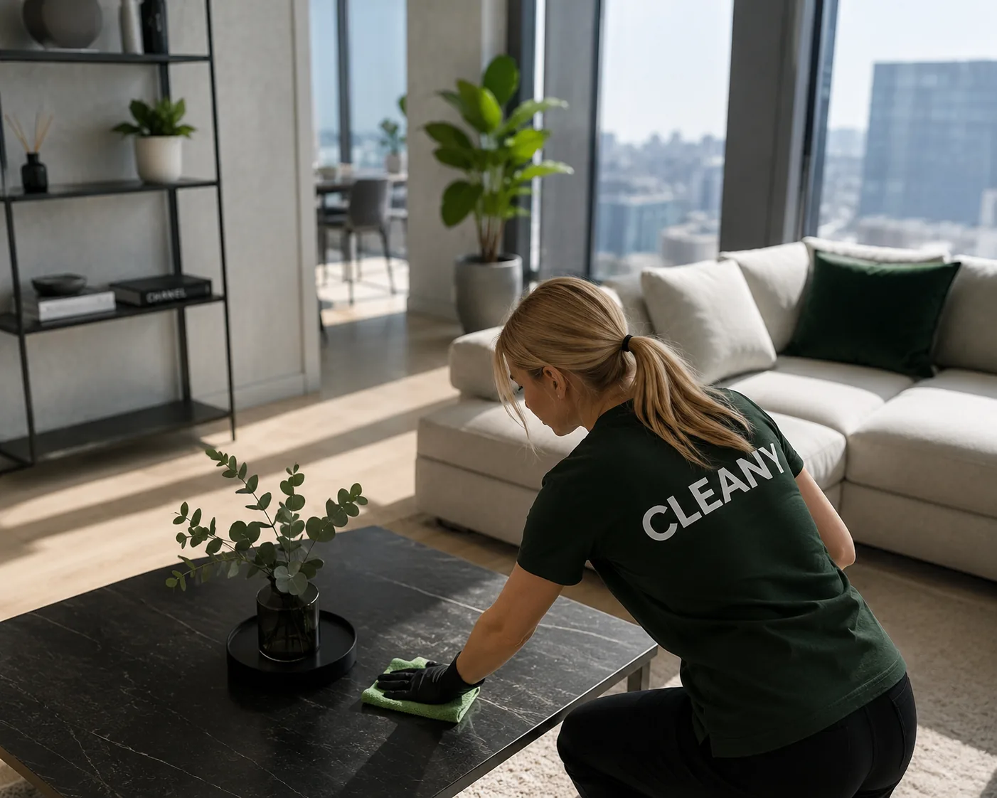
Construction dust gone in a single visit.
Tablet and phone
The site adapts to every screen: on a tablet and a phone the layout rebuilds itself. Scroll inside the frames.
Before
and after
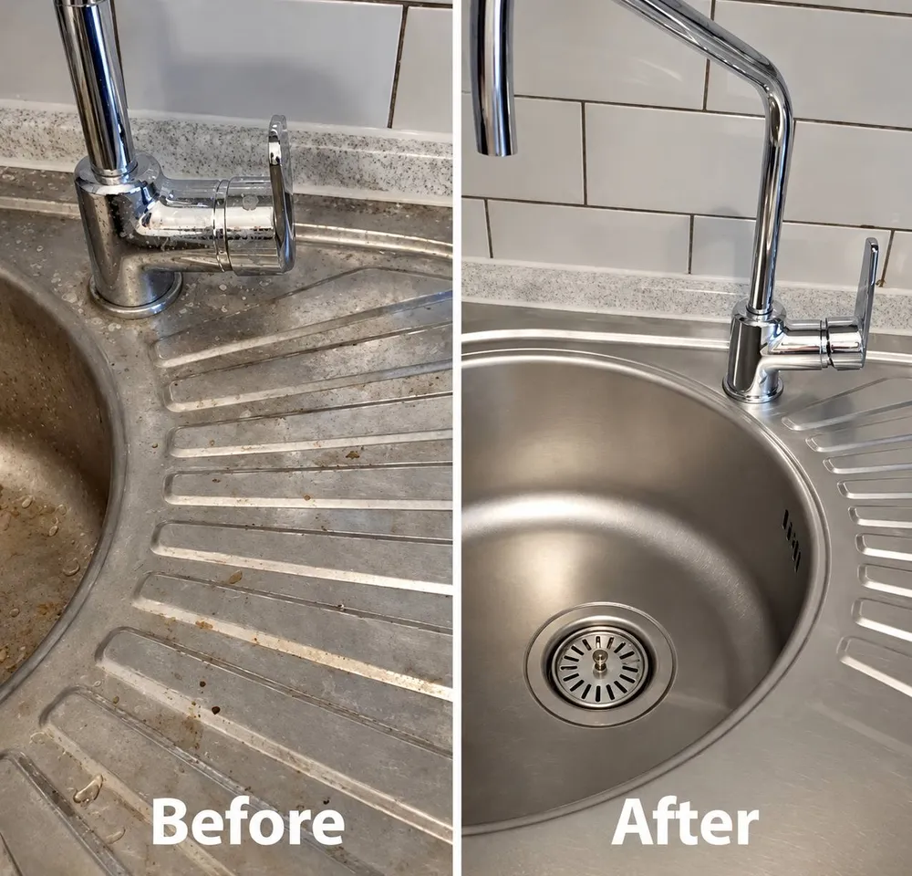
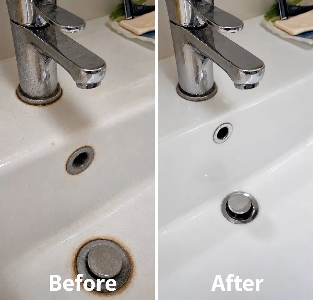
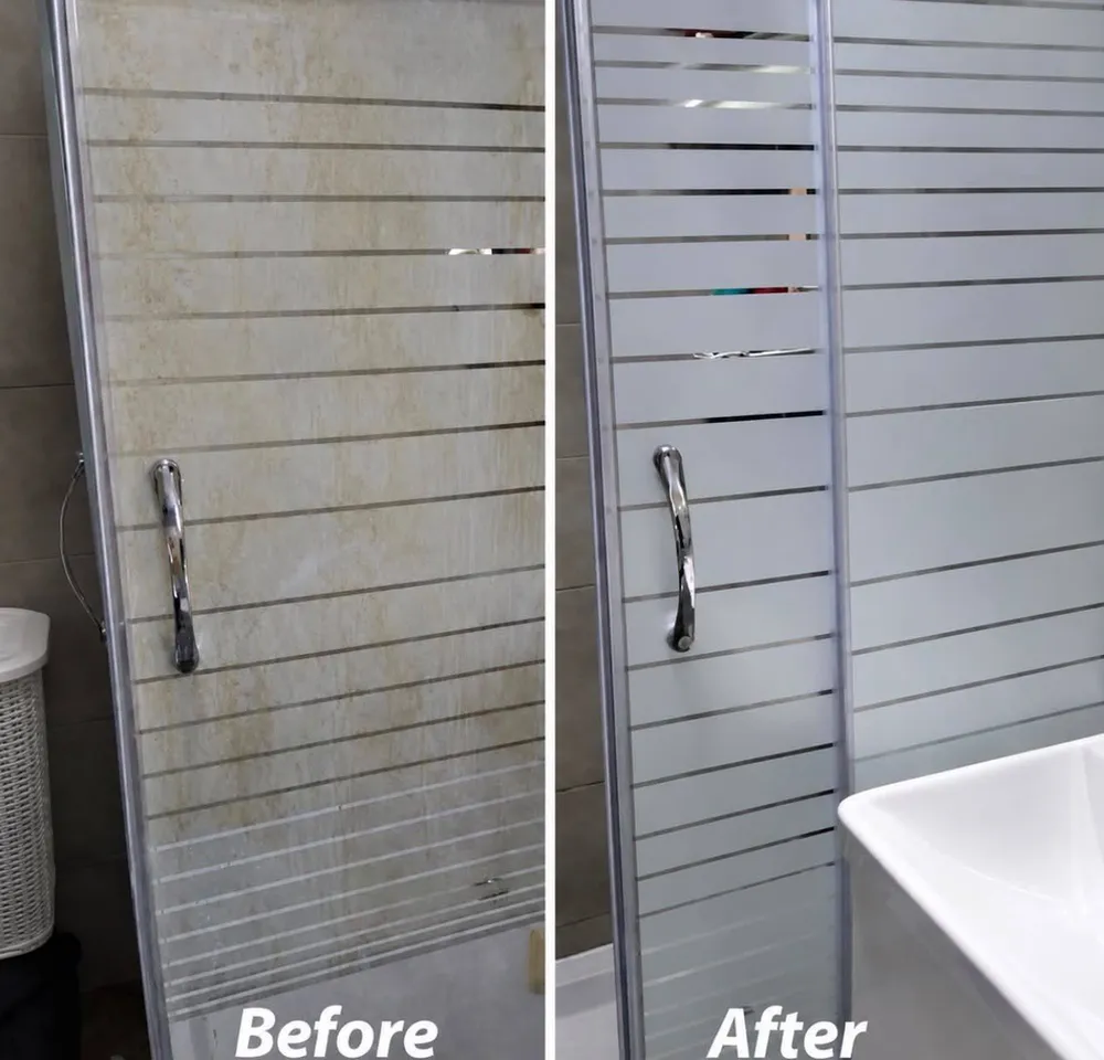
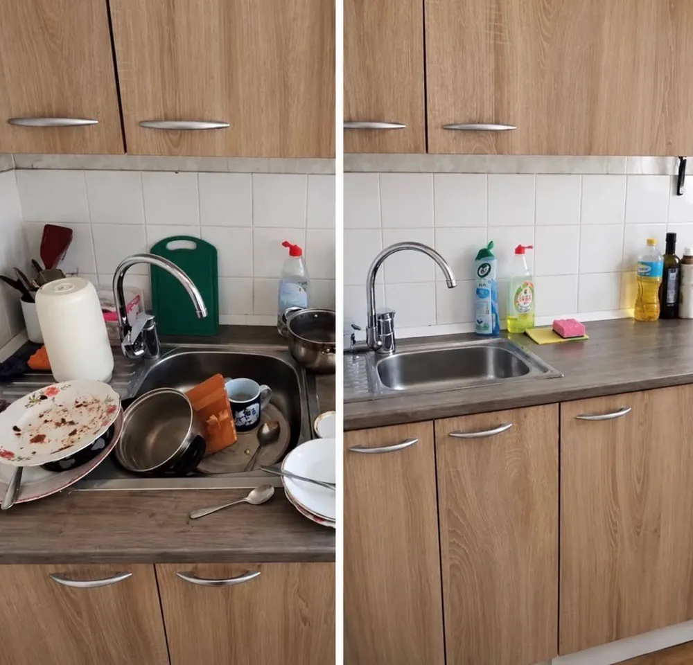
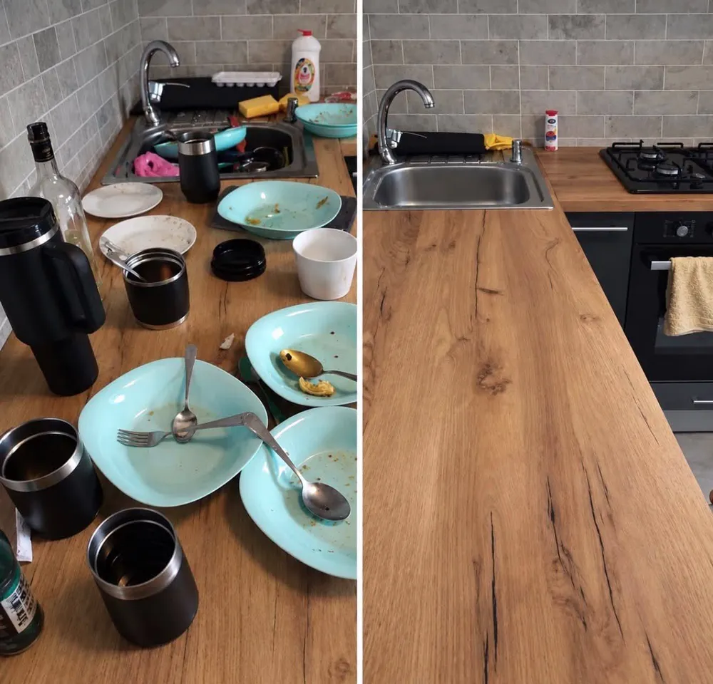
A swipeable gallery of real jobs: sinks, shower glass, kitchen surfaces. Proof of quality that doesn't need a single adjective.
Built from
scratch
No templates and no off-the-shelf themes. From the logo to the last analytics goal, everything was designed and built in our studio.
- 01
Logo & mark
A drop-shaped mark with a leaf-vein cut, used as logo, favicon and social avatar.
- 02
Palette & type
Deep olive, sage and warm beige, set in Golos Text and Inter.
- 03
Web design
Every section of the landing page, from the hero to the order form.
- 04
Interactive reveal
A canvas “wipe the dust” effect that shows the clean result.
- 05
Motion
Scroll reveals, split-text headings, magnetic buttons and custom cursor.
- 06
Order form
A short form with optional extras, sent straight to the owner.
- 07
Mobile
Designed separately for phones, with a quick-contact bar.
- 08
Reviews & FAQ
Client reviews and answers to common questions, built to remove doubts before the order.
- 09
SEO & blog
Structured data, a sitemap and 24 local-search articles.
- 10
Analytics
Goals for calls, Telegram clicks and form leads, plus lead-source tracking.
Want a site like this?
Tell us about your business and we'll show you how to present it so customers want to buy.